Recently, I worked closely with Pandas and found out a few things that are might common knowledge but were new to me and helped me write more efficient code in less time.
1. Don’t drop the na
Count the number of unique values including Na values.
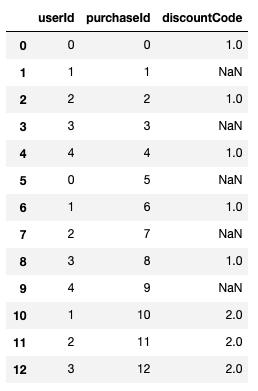
Consider the following pandas DataFrame –
df = pd.DataFrame({"userId": list(range(5))*2 +[1, 2, 3],
                   "purchaseId": range(13),
                   "discountCode": [1, None]*5 + [2, 2, 2]})
Result
If I want to count the discount codes by type I might use – df['discountCode'].value_counts() which yields –
1.0    5
2.0    3
This will miss the purchases without discount codes. If I also care about those, I should do –
df['discountCode'].value_counts(dropna=False)
which yields –
NaN    5
1.0    5
2.0    3
This is also relevant for nuniqiue. For example, if I want to count the number of unique discount codes a user used – df.groupby("userId").agg(count=("discountCode", lambda x: x.nunique(dropna=False)))
See more here – https://pandas.pydata.org/pandas-docs/stable/reference/api/pandas.DataFrame.nunique.html
2. Margin on Row \ columns only
Following the above example, assume you want to know for each discount code which users used it and for each user which discount code she used. Additionally you want to know has many unique discount codes each user used and how many unique users used each code, you can use pivot table with margins argument –
df.pivot_table(index="userId", columns="discountCode",
               aggfunc="nunique", fill_value=0,
               margins=True)
Result –
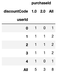
It would be nice to have the option to get margins only for rows or only for columns. The dropna option does not act as expected – the na values are taken into account in the aggregation function but not added as a column or an index in the resulted Dataframe.
3. plotly backend
Pandas plotting capabilities is nice but you can go one step further and use plotly very easy by setting plotly as pandas plotting backend. Just add the following line after importing pandas (no need to import plotly, you do need to install it) –
pd.options.plotting.backend = "plotly"
Note that plotly still don’t support all pandas plotting options (e.g subplots, hexbins) but I believe it will improve in the future.
See more here – https://plotly.com/python/pandas-backend/
4. Categorical dtype and qcut
Categorical variables are common – e.g., gender, race, part of day, etc. They can be ordered (e.g part of day) or unordered (e.g gender). Using categorical data type one can validate data values better and compare them in case they are ordered (see user guide here). qcut allows us to customize binning for discrete and categorical data.
See documentation here and the post the caught my attention about it here – https://medium.com/datadriveninvestor/5-cool-advanced-pandas-techniques-for-data-scientists-c5a59ae0625d
5. tqdm integration
tqdm is a progress bar that wraps any Python iterable, you can also use to follow the progress of pandas apply functionality using progress_apply instead of apply (you need to initialize tqdm before by doing tqdm.pandas()).
See more here – https://github.com/tqdm/tqdm#pandas-integration
