In recent weeks, I completed Northwestern University’s Organizational Leadership Specialization on Coursera. While the courses span different topics- storytelling, social influence, negotiation, and more- two recurring themes stood out to me.
1. Preparation changes everything Effective leadership and communication rarely happen “in the moment.” Preparation matters – even when you don’t yet know the formal frameworks or terminology.
Whether it’s thinking through your BATNA (Best Alternative to a Negotiated Agreement), identifying your ZOPA (Zone of Possible Agreement), or simply anticipating objections, the key habit is stepping into the other side’s perspective before the interaction happens. Strong outcomes are usually built long before the conversation begins.
2. The audience is the message People are driven by different motivations, constraints, and perceptions. That means the same message can land very differently depending on how – and to whom – it is delivered.
Leadership is not just about what you say, but how you tailor it: language, framing, medium, and emphasis all matter. This is something I first learned as a scout leader, and it has stayed with me for nearly 25 years. It remains one of the most consistently useful leadership principles I’ve encountered.
At the same time, I’ve often seen a common anti-pattern: leaders trying to motivate others based on what motivates them, rather than what actually drives the person in front of them. Good intent, misaligned execution.
Ultimately, both lessons point to the same idea: leadership is less about projecting your intent and more about deeply understanding context – both the situation and the people in it.
Ron Wallace started as a UPS driver in rural Idaho in 1966 and retired 36 years later as President of UPS International, running operations in 200+ countries. His book, “Leadership Lessons from a UPS Driver,” turns that climb into a handful of blunt, unglamorous principles. Here are four insights that stayed with me –
1. Best 5 vs 5 best.
Five average players who move as a unit beat five stars who don’t. With AI blurring roles – PMs writing code, engineers writing specs – how well a team moves together matters more than any one person’s skill ceiling.
2. Manage yourself before you manage others.
You can’t ask for discipline you don’t have. When everyone has an agent doing part of their job, self-management – what to delegate, what to check, what to own – is the whole game.
3. 10% planning, 90% execution.
That ratio assumed execution was the bottleneck. Agents and other tools now handle much of the execution. Does the split flip? Not sure – bad planning just produces fast, wrong output at scale. But the balance is shifting, and finding the new ratio is one of the more interesting problems before us.
4. Change is inevitable; growth is optional.
UPS survived by repeatedly outgrowing its own identity. Feels like the line of the year – nobody’s job description is stable, and adapting is a choice, not a default.
AI coding agents burn tokens on things they don’t need to see in full – verbose logs, entire files read for one function, repeated context across turns. A wave of tools now attacks this from different angles: some rewrite noisy output before it reaches the model, some compress what’s already in context, some change what the agent generates or reads in the first place. Here is a short survey about the different tools.
rtk — github.com/rtk-ai/rtk A CLI proxy that hooks into Bash tool calls and rewrites common commands (git status, cargo test, kubectl, etc.) into compact equivalents before output hits context – a noisy git push becomes ok main. Claims 60–90% savings on covered operations, plausible since the approach is narrow and mechanical. Watch for: only intercepts Bash calls – native Read/Grep tool usage bypasses it entirely, so real-world savings depend heavily on how your agent works. Best for: teams whose agents lean on shell commands for everything (git, test runners, infra CLIs); less useful if the agent mostly reads files directly.
Caveman — getcaveman.dev A family of products: a compression skill, a standalone token-budgeted coding agent, a persistent memory layer, and a compression proxy (beta). Claims ~65% token reduction. Watch for: thin evidence – the site leans on stars and HN placement rather than a reproducible benchmark; the four products make it unclear which piece drives the number. Best for: teams wanting a single umbrella tool across several angles at once, and willing to validate the number themselves before committing.
Ponytail — alphamatch.ai/blog/ponytail-ai-coding-skill-2026 Attacks generation, not context: forces the model through a “does this need to exist” ladder before writing code, preferring stdlib/native/existing-dependency solutions. Own benchmark shows LOC cut to ~46% of baseline and cost down by 47–77%, but token usage itself drops only by ~16%. Watch for: it’s solving a different problem than the others — don’t expect it to shrink context windows; the win is fewer lines and less rework, not less reading. Best for: codebases with a lot of unnecessary custom code; less relevant if your token spend is mostly context/tool output, not generation.
Headroom — headroom-docs.vercel.app/docs Compresses everything an agent reads — tool output, file reads, API/DB responses — via type-specific compressors, with a reversible retrieve path back to full detail. Vendor case study: 87.6% fewer input tokens in a log-heavy scenario. Watch for: numbers are vendor case studies on scenarios they chose; the retrieval mechanism adds a round trip when the model needs detail back. Best for: agents that use tools heavily against verbose sources (logs, API responses, DB queries); less relevant for short, code-only sessions.
Graphify — github.com/Graphify-Labs/graphify Avoids re-reading altogether: builds a local knowledge graph of the codebase, then the agent queries it instead of repeatedly grepping files. Watch for: it’s not compression — savings materialize only over a session with repeated lookups in a large, stable codebase; non-code content (docs, PDFs) still requires API calls to extract. Best for: large, mature repos with frequent navigation; little benefit for small projects or one-off tasks.
Tool
Mechanism
What it targets
Claimed savings
Evidence
rtk
Rewrites known-noisy CLI output
Bash tool output only
60–90% on covered ops
Vendor, narrow scope
Caveman
Compression skill + memory layer + proxy
Prompts, outputs, cross-turn context
~65% tokens
Vendor, thin (stars/HN)
Ponytail
Decision ladder before writing code
Code generation, not context
~16% tokens; 47–77% cost; 3–6x speed
Vendor benchmark (5 tasks × 3 models)
Headroom
Type-aware compression + reversible cache
All tool/context input
87.6% input tokens (case study)
Vendor case study
Graphify
Knowledge graph instead of re-reading files
Repeated file reads/greps
Not quantified
Vendor, mechanism differs from compression
I want more. Can we stack them on one another?
Each method targets different layers, so most combinations aren’t mutually exclusive. Ponytail acts at generation time (what code gets written), Graphify acts at retrieval time (avoiding re-reads), and rtk/Caveman/Headroom all act at the context-shaping layer, i.e., what enters the prompt. In principle, we can run all method at once without them fighting each other structurally.
Where it gets tricky is the overlap among the context-shaping tools. rtk and Headroom both intercept and rewrite content before it reaches the model, just at different points – rtk hooks Bash tool calls while Headroom sits more generally across tool outputs, file reads, and API responses. Stacked, we’re likely to get diminishing returns rather than additive savings: once rtk has already collapsed a git status to one line, there’s little left for Headroom to compress on that same output. Caveman’s compression skill/proxy likely overlaps with both in the same way—three tools converging on the same noisy CLI output mostly means redundant passes, not three times the savings. Worse case: extra latency for near-zero extra token reduction.
Ponytail and Graphify are the cleaner additions. Ponytail’s effect is upstream of everything else (less code gets written and read in the first place), so it should compound with anything downstream rather than compete with it. Graphify’s effect is about not re-fetching content at all – if the agent never re-reads a file, there’s nothing left for rtk/Caveman/Headroom to compress on that read, which sidesteps the overlap problem entirely rather than creating one.
The more promising stack is probably Ponytail (write less) + Graphify (re-read less) + one of rtk/Caveman/Headroom (compress what’s left) — rather than running all three context-shaping tools together, which likely adds overhead with little additional token savings.
Reducing token cost is an issue every firm currently deals with, and it isn’t one problem – it’s at least three: noisy tool output, unnecessary code generation, and repeated re-reading of the same content. rtk, Caveman, and Headroom all attack the first at different points in the pipeline, with real but overlapping coverage. Ponytail attacks the second, upstream of everything else. Graphify sidesteps the third by building a queryable map instead of re-fetching files. None of these are competing solutions to the same problem so much as partial answers to different pieces of it – which means the right setup is probably a small combination, not a single winner, and probably depends more on where your own token spend actually goes (shell noise vs. generated code vs. repeat lookups) than on any vendor’s headline number. All of the figures cited here are self-reported, and the stacking behavior is reasoned from mechanism rather than measured – so treat this as a map of what to test, not a verdict on what to use.
I recently read Spec-Driven Development by Haim Michale, and it resonated with some day-to-day thoughts about SDD.
The problem SDD aims to solve isn’t new
Missing, incomplete, and ambiguous requirements that evolve over time have always plagued software delivery, but it is now amplified: the pace is faster, LLMs have a strong tendency to fill gaps by guessing, and they carry zero tribal knowledge – no kitchen-table conversations, no “oh, we tried that in 2022” instincts. EARS syntax (Easy Approach to Requirements Syntax) is an interesting framework for making requirements more machine-readable, but it still requires a human to steer it. The spec is only as good as the intent behind it.
Legacy code and brownfield projects are the elephant in the room
Most SDD content assumes you’re starting fresh. But the vast majority of engineering work happens in systems with years of accumulated decisions, undocumented assumptions, and implicit context baked into the codebase. Making that accessible to coding agents, let alone to SDD, is a real and largely unsolved problem. As far as I’m aware, there are no clear best practices or guidelines here yet. This is an area we need to tackle head-on.
SDD also accelerates a role blur we’re already talking about
If specs are first-class artifacts that live in the repo, who writes them? Do PMs start pushing requirements documents directly into codebases, expanding into territory traditionally owned by engineers? Do developers take on deeper responsibility for refining and maintaining specifications? Both are plausible. Neither is cost-free. The boundary is getting blurry fast.
And drift…
Drift is what happens when specs and code silently diverge: a requirement changes, but the spec file doesn’t, or a PR lands and the corresponding document isn’t updated. Over time, specs stop describing the system, and that’s arguably worse than having no specs at all, because they create false confidence. My suggestion: drift detection should be treated as a core part of repo gardening. Flag when code changes without a corresponding spec update, and vice versa. Make it visible, not something that accumulates quietly in the background. Expect spec debt terminology coming soon.
While different SDD methodologies vary in the exact documents they produce, I found the attached screenshot a useful cheat sheet for knowing when to update which document.
📚 Just finished “RAG Made Simple: The Complete Visual Guide to Retrieval-Augmented Generation” by Nir Diamant, and it happened to be one of those rare cases where the book actually matches how I learn. What worked especially well for me are the summaries – when to use each technique, when it’s overkill, and what the trade-offs are. That comparative lens – grounding new methods against what came before is exactly what I need to internalize something. If you only have time for a sneak peek, read the appendix on debugging and choosing the right approach.
Theory vs. practice – in real production systems, no single RAG method is enough. Different techniques address different failure modes, and a stable, reliable system almost always requires combining several of them.
Three techniques worth calling out:
🔮 HyDE (Hypothetical Document Embeddings) – my most surprising find. The idea is to generate a fake answer to the query, then use it to retrieve real documents. Elegant solution to the structural mismatch between how questions are phrased and how answers are written. “Fake it ’til you make it” as a retrieval strategy.
🎯 Dartboard Retrieval – most useful for me personally. A problem I’ve bumped into repeatedly – in RAG and in recommendation systems + where you need to balance precision with coverage across varying distance thresholds.
🖼️ Multi-modal RAG – most overlooked, and massively underrated, usually skipped when building an MVP. Especially for internal knowledge bases: being able to retrieve diagrams, tables, screenshots, and slides alongside text is genuinely transformative. In my experience, much of an organization’s information is in decks, charts, images, etc.
Three recent incidents that should make all of us pause:
→ A hallucinated npx command spread through a single LLM-generated skill file to 237 repositories. Real agents executed it. A researcher claimed the package name before an attacker could.
→ 230+ malicious skills uploaded to OpenClaw’s ClawHub in days. The #1-ranked skill was silently exfiltrating data and injecting prompts to bypass safety guidelines. Thousands of downloads before anyone noticed.
→ An audit of 2,890+ OpenClaw skills found 41.7% contain serious security vulnerabilities.
This isn’t a niche problem. If you use Claude Code, Cursor, Copilot, or any modern coding agent, you’re likely installing multiple skills a week. They are recommended by colleagues, appear in blog posts, and are bundled into project templates. The install command is one line. The trust is implicit.
Skills blur the line between configuration and code, but we treat them like documentation. A SKILL.md file can contain natural-language instructions, executable scripts, and package dependencies. There’s no clear boundary where “docs” ends and “code” begins. No lockfile. No integrity checks. No verified publisher identity. The skills CLI has a package-lock.json for its own dependencies – just not for the skills you install.
So what should we do today? At a minimum, read the skill files before installing. It takes 2 minutes and is the equivalent of reviewing a PR. Beyond that, copy and commit your skills folder to git – your repo becomes your lockfile. Treat any skill update like a dependency upgrade: review the diff before merging, also for testing and quality purposes.
The tools are coming – Longer term, this ecosystem needs what npm took 6 years to build: lockfiles, signed packages, verified publishers, and scanners that flag malicious instructions before they reach your agent. Cisco developed an open-source skill file scanner.
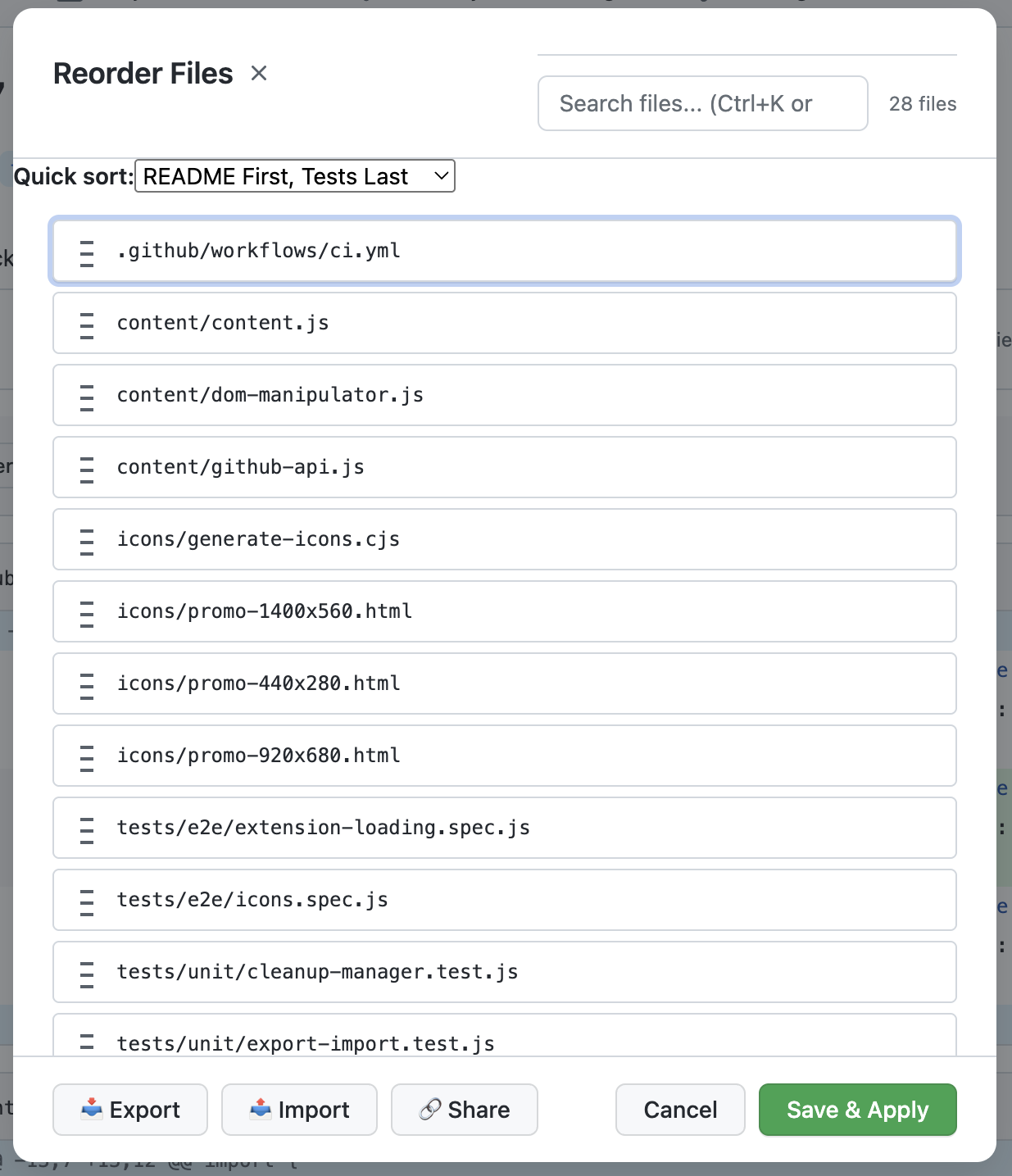
The day-to-day work of software engineers is shifting – less time is spent on implementation, and more on specifying, planning, and reviewing. As AI coding tools improve, the bottleneck moves upstream and downstream: writing clear specs, structuring changes well, and conducting thoughtful reviews become the highest-leverage skills.
One surprisingly weak point in that workflow is GitHub PR file order. Files are shown in alphabetical order that rarely reflects the logical flow of the change. Good reviews are narrative: start with the contract, then the core logic, then the edges and tests. When the order is wrong, reviewers waste cognitive energy reconstructing the story instead of evaluating the change.
That realization pushed me to build a small Chrome extension that lets you reorder files in a PR so the review reads in the right order. Check it out here.
It was also a personal reminder of the joy of doing something for the first time – I never built a Chrome extension before. My first attempt was messy and unsuccessful, so I wiped everything and restarted using Spec-Driven Development (SDD) with OpenSpec. The second iteration was dramatically smoother, more structured, and consumed fewer tokens. In a world where implementation is getting cheaper, clarity in specs, understanding of trade-offs, and the review experience are quickly becoming the real craft of engineering.
Fun fact about me – I played Rugby Sevens for years, including on a national team. It taught me more about engineering leadership than I expected. Small teams, huge space, high speed – Sevens and modern engineering run on the same dynamics.
Here are 7 lessons Sevens taught me about engineering leadership.
1️⃣ It’s Not About Weight – It’s About Teamwork
The first lesson I learned came from scrumming with a weight disadvantage but a huge coordination advantage. In Rugby (in 15s even more than in 7s), you don’t win scrums because your players are heavier. A team wins because: you bind together, you push at the same moment, you trust the rhythm. In lineouts, timing matters more than height, and coordination matters more than individual strength.
In engineering, this shows up everywhere:
A brilliant engineer misaligned with the team slows progress.
A “lighter” team moving in sync outperforms a group of heavy hitters pulling in different directions.
Velocity is not the sum of individual forces. It’s a synchronized force.
Lesson: Coordination multiplies talent.
2️⃣ Communication should be Constant and Loud
In Rugby Sevens, silence is dangerous. Players shout constantly:
“Inside!”
“Switch!”
“Up!”
“Blind!”
It’s not noise – it’s alignment. There’s too much space and speed to assume others know what you’re thinking.
In an office, you get accidental alignment:
Body language
Whiteboard moments
Corridor clarifications
In remote work, silence becomes ambiguity. If communication isn’t explicit and frequent, gaps appear.
Lesson: Constant communication creates alignment.Alignment brings results.
3️⃣ You Can Only Pass Backwards
In rugby, you’re only allowed to pass the ball backwards.
If you want to move forward, you must either run forward yourself or align with teammates who are already in motion
You can’t throw the ball ahead and hope someone figures it out. The constraint forces structure.
To gain ground, teams spread wide.
They create overlap.
They run support lines before they’re needed.
They time short, precise passes.
You go forward by passing backward – and that only works with discipline. In engineering, this principle shows up everywhere. You can’t “pass forward” sloppily:
Product can’t throw half-defined specs over the wall
Engineering can’t push messy code to QA
Leadership can’t announce strategy without alignment
When work is tossed ahead without positioning and support, the play breaks. Real velocity doesn’t come from heroic sprints. It comes from synchronized movement.
Too many handoffs? You lose momentum. Too few? You get isolated and tackled.
In Sevens tournaments, you play multiple games on the same day.
Win big? Reset. Lose badly? Reset.
The next kickoff has no memory.
Engineering teams often carry emotional baggage:
A big launch → complacency
An outage → overreaction
Strong teams don’t ignore outcomes – they process them quickly. They celebrate briefly, learn fast, and show up focused for the next “game.”
Lesson: Don’t let yesterday’s result dictate today’s execution.
5️⃣ Scoring Under the Posts vs Securing the Try
In rugby, when a player breaks through, they often try to run closer to the center before grounding the ball.
Why? Because it makes the conversion kick easier.
But that extra effort increases the risk of being tackled and losing the try entirely.
In engineering:
Do we ship now?
Or optimize a bit more?
Refactor first?
Polish the UI further?
Sometimes we optimize the conversion and lose the try.
Lesson: Secure value first. Optimize second.
6️⃣ You Don’t Always Need More Resources – Just a Change of Angle
In Sevens, attacking the wide-open side is obvious. Great teams exploit the blind side instead.
You don’t need more force. You need better perspective.
In engineering:
Reframing a product problem
Reorganizing teams instead of hiring more
Solving a process issue instead of pushing harder
Sometimes the breakthrough isn’t scaling effort – it’s shifting angle.
Lesson: Strategy beats brute force.
7️⃣ Commit Fast – Adjust Faster
In Rugby Sevens, hesitation kills.
Pause before a tackle, you miss. Delay the pass, the overlap’s gone. Half-commit to a line break, and you get isolated.
The game rewards decisiveness.
Engineering leadership is the same. Over-analysis drains momentum. Once you pick a direction, the team needs full commitment – not tentative buy-in where everyone’s still hedging.
But here’s the nuance: when a defender overcommits, great players side-step. Decisiveness doesn’t mean rigidity. You commit fully, and when new information shows up or the situation shifts, you adjust fast – without ego, without drama.
The Quarterback Paradox – while I’m not sure I agree that it is a paradox – i.e., recruiting a critical position to an organization is hard even if you have a lot of data, I love and strongly agree with the suffix of the post – “As in the NFL, in organizations the hardest part is often not finding talent, but creating the conditions in which real potential does not break before it has a chance to become reality.”
What LEGO Can Teach Us about Autonomy and Engagement – Who doesn’t like LEGO? We all played with it as children, and some of us still build today. In this post, Pawel Brodzinski describes a neat experiment he runs in training sessions – teams first build a LEGO set under a manager’s direction, then self-organize for a second build, and consistently report higher engagement when given more autonomy. While it shows a clear effect, the experiment has some drawbacks – most notably an order effect: the self-organized build always comes second, so the engagement boost could partly stem from participants being warmed up and more comfortable rather than from autonomy alone. Always nice to read about LEGO as an adult.
Skyll– Skills are markdown instruction files that teach AI coding agents how to perform specific tasks. Today, skills must be manually installed before a session, meaning developers need to know upfront which skills they’ll need. Skyll is an open-source search engine and API that lets any AI agent discover and retrieve skills on demand at runtime, ranked by relevance, without pre-installation. You can think of it as a package manager for agent capabilities, enabling agents to be truly self-extending and autonomous.
Skyhook.io radar – Existing K8s dashboards tend to be either heavyweight, cloud-dependent, or require cluster-side components. Radar’s zero-install, single-binary approach with real-time topology and traffic visualization answers the need of developers and platform teams who want quick, frictionless cluster observability that can even run on their laptop, especially useful for DevEx-focused teams looking to reduce the friction of Kubernetes debugging and operations,
Babysitter – If you worked with coding agents, you probably experienced this pain: the lack of a structured process control and non-deterministic workflows. Babysitter lets you define iterative workflows (research → spec → TDD loop → quality gate → deploy) that are deterministic, resumable across sessions, and auditable, which is critical for moving AI-assisted development from ad-hoc experimentation toward reliable, production-grade engineering workflows and complex features.
With the growing adoption of AI and recent moves like Anthropic’s Cowork plugin marketplace, there’s a popular narrative that traditional SaaS is dead. The implication is that the combination of AI agents + marketplaces will commoditize software entirely, and the old subscription paradigms won’t survive.
I tend to believe that’s an overstatement. SaaS isn’t dying – it’s evolving. What is under threat is SaaS as we’ve known it: long-term seat licenses, one-size-fits-all tiers, and feature-driven pricing. AI makes core functionality easier to replicate and access, pushing raw features toward commodity status. The value and pricing increasingly lie in outcomes, workflows, integrations, and customer trust. More than in the past, pricing is a strategic tool. See a similar conversion in David Ondrej’s post on Twitter (link in the first comment)
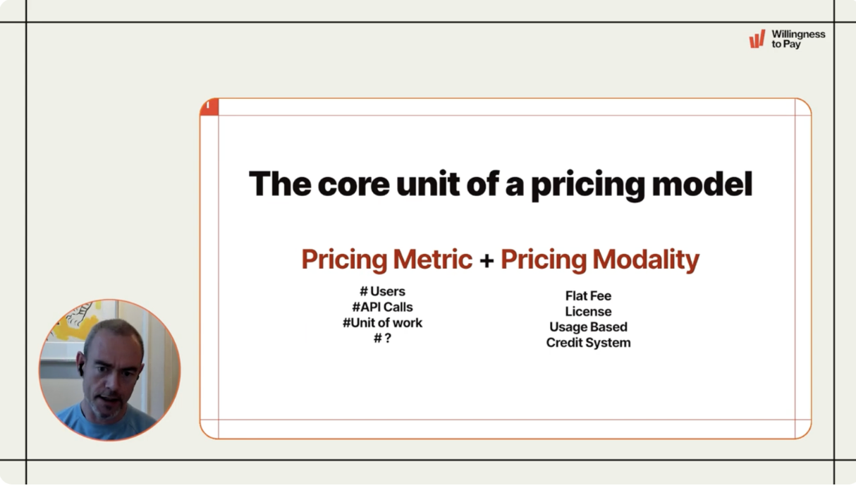
That’s why understanding the possible pricing models and their tradeoffs matters more than ever. I’ve been listening to Ulrik Lehrskov-Schmidt’s webinar series on Agentic AI pricing –“Making Money in Uncertain Times.” In a world where both cost structures (compute, labor, infrastructure) and capabilities (model performance, automation) are shifting rapidly, we can’t anchor pricing to static assumptions. Instead, pricing needs to reflect real value delivery, signal predictable economics to customers, and align engineering decisions with business outcomes.
This isn’t just a GTM or sales conversation – it’s also a core product and engineering conversation. How we design systems, how we think about metrics and outcomes, and how we package those outcomes for customers all influence pricing levers.