Playing with DALL·E mini

DALL·E 2 is a multimodal AI system that generates images from text. OpenAI announced the model in April 2022. OpenAI is known for GPT-3, an autoregressive language model with 175 billion parameters. DALL·E 2 uses a smaller version of GPT-3. Read more herehere, and here (the last one also slightly discusses Google’s image).

While the results look impressive at first sight, there are some caveats and limitations, including word order and compositionality issues, e.g., “A yellow book and a red vase” from “A red book and a yellow vase” are indistinguishable. Moreover, as one can see in the “A yellow book and a red vase” example below the images or more of the same, another drawback is that the system cannot handle negation, e.g., “A room without an elephant” will create, well, see below. Read more here.

Since I don’t have access to DALL·E 2, I used DALL·E mini via Hugging Face for all the examples in this post. However, the two models experience the same issues.

A yellow book and a red vase
A room without an elephant

The model might have biases for example check all those software developers who write code, all men (also note that the face are very blurry in contrast to other surfaces in the images) –

software developer writing code
A CTO giving a talk

I decided to troll that a bit to find more limitations or point-out blind spots. Check out the following examples –

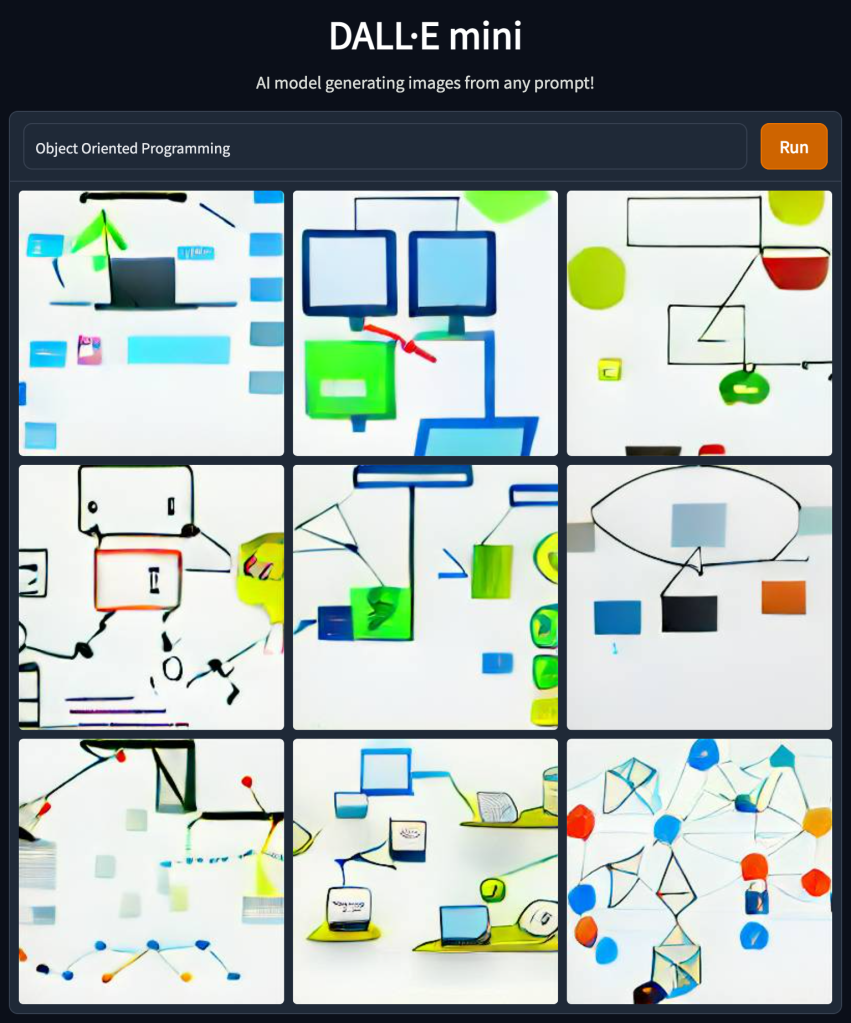
Object Oriented Programming
OOP
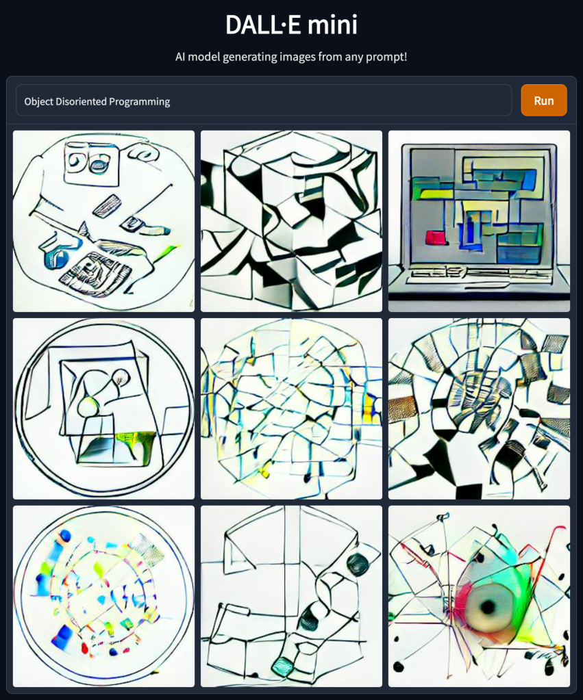
Object Disoriented Programming
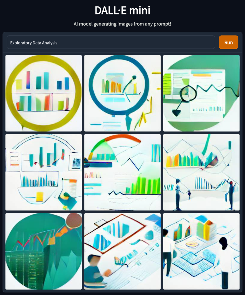
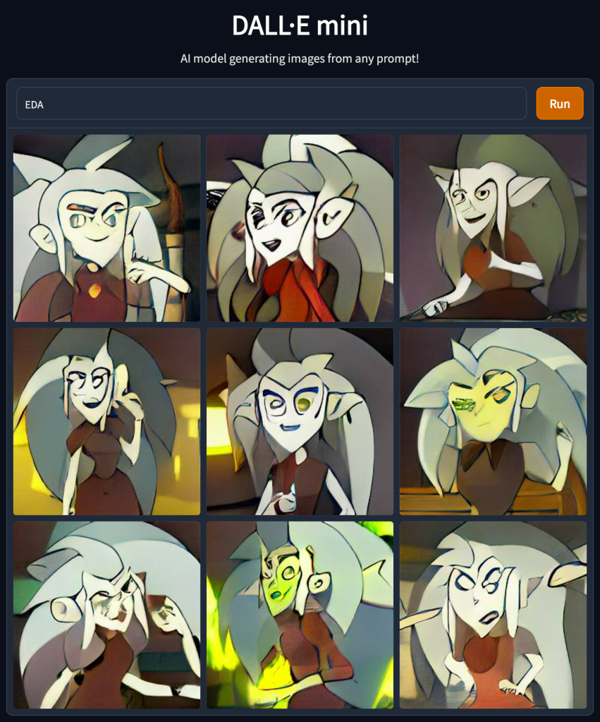
Exploratory Data Analysis
EDA

The examples above demonstrate that model does not handle abbreviations well. I can think of several reasons for that, but that emphasizes the need to use precise wording and might need to try several times to get the desired result.

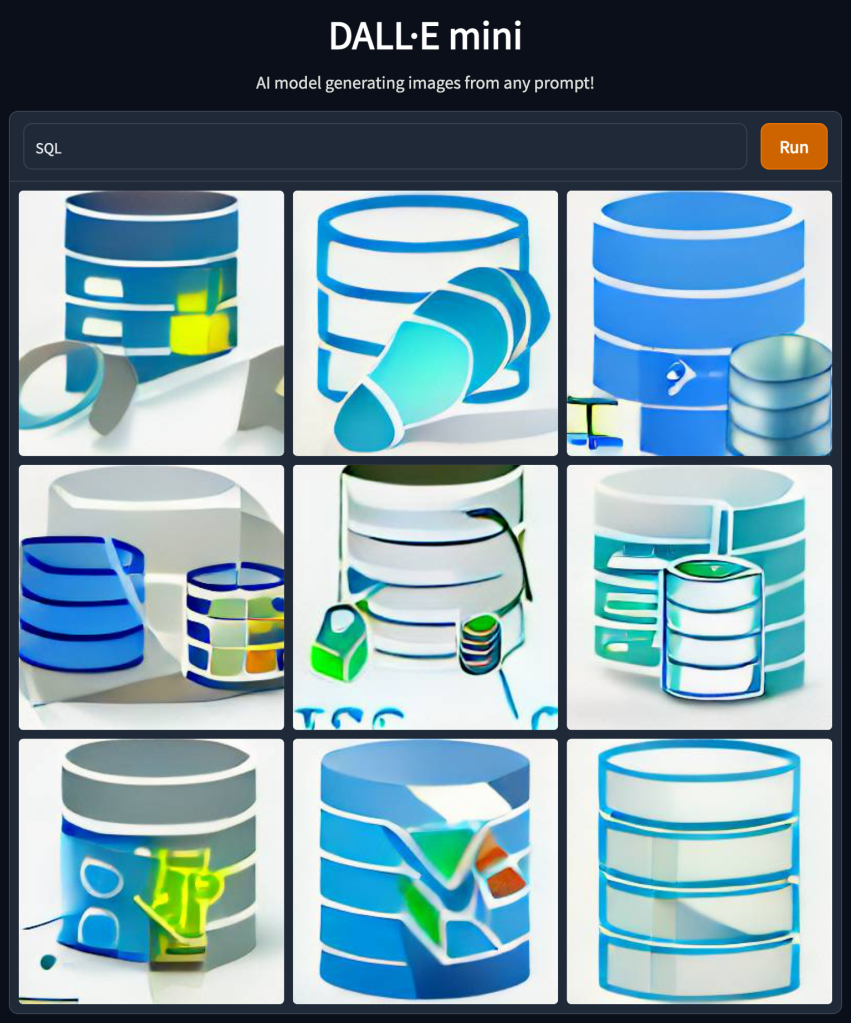
Trying negation again (in this case, the abbreviation worked okish) –

SQL
NoSQL
Structured Query Language

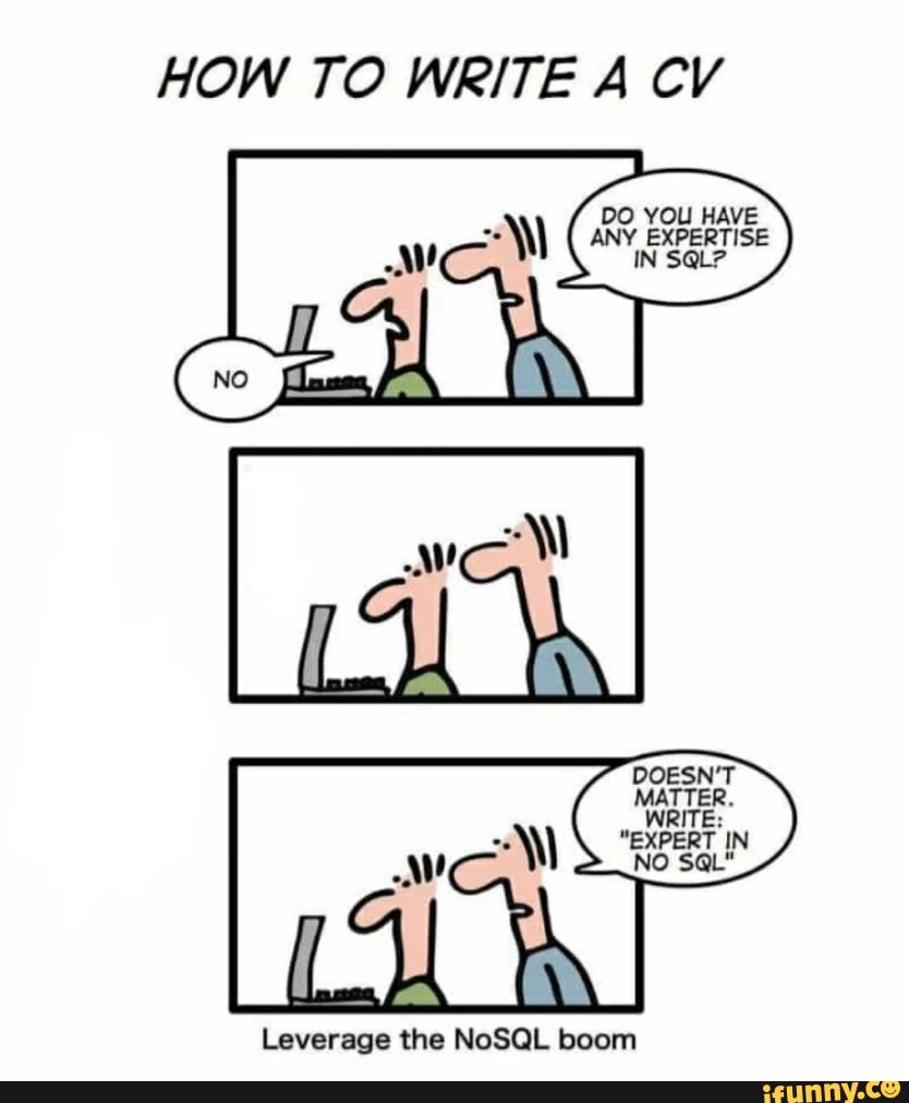
Which of course reminds all of us of this one –

And a few more –

SOLID principles
Clean Code
Computer Vision

To conclude, I cannot see a straightforward production-grade usage of this model (and it is anyhow not publically available yet) but maybe one use it for brainstorming and ideation. For me it feels like NLP in the days of TF-IDF there is yet a lot to come. Going forward I would love to have some more tunning possibilities like a color scheme or control the similarity between different results (mainly allow more diversity rather than more of the same).

5 interesting things (20/06/2022)

Visualizing multicollinearity in Python – I like the network one although it is not very intuitive at first sight. The others you can also get using pandas-profiling.

https://medium.com/@kenanekici/visualizing-multicollinearity-in-python-b5feedc9b3f1

Advanced Visualisations for Text Data Analysis – besides the suggested charts themselves, it is nice to get to know nxviz. I would actually like to see those charts as part of plotly as well.

https://towardsdatascience.com/advanced-visualisations-for-text-data-analysis-fc8add8796e2
Data Tales: Unlikely Plots – bar chart is boring (but informative :), but sometimes we need to think out of the box plot

https://medium.com/mlearning-ai/data-tales-unlikely-plots-1882c2a903da

XKCDs I send a lot – Is XKCD already an industry standard?

https://medium.com/codex/xkcds-i-send-at-least-once-a-month-1f6e9f9b6b89

5 Tier Problem Hierarchy – I use this framework to think of tickets I write, what is the expected input, output, and complexity, what I expect from each of my team members, etc.

https://typeshare.co/kimsiasim/posts/5-tier-problem-hierarchy-4718

Prioritize your Priority Score

A while ago, a friend asked me about a topic she needed to tackle – her team had many support tickets to prioritize, decide what to work on, and further communicate it to the relevant stakeholders.

They started as everyone starts – tier 1 and tier 2 support teams in their company stated the issue severity (low, medium, high) in the ticket, and they prioritized accordingly.

But that was not good enough. It was not always clear how to set the severity level – was it the client size or lifecycle stage, the feature importance, or anything else. Additionally, it was not granular enough to decide what to work on first.

We brainstormed, and she told me two important things for her: feature importance and client size. Both can be reduced to “t-shirt” size estimation, i.e., small client, medium client, large client, and extra-large client, and features of low/medium/high/crucial importance. Super, we can now generalize the single dimension axis system we previously had to two dimensions.

The priority score is now – \sqrt{x^2+y^2}

That worked great until they had a few tickets that got the same priority score, and they needed to decide what to work on and explain it outside of their team. The main difference between those tickets was the time it would take to fix each one. One would take several hours, one would take 1-2 days, and the last one would take two weeks and has high uncertainty. No problem, I told her – let’s add another axis – the expected time to fix. Time to fix can also be binned – up to 1 day, up to 1 week, up to 1 sprint (2 weeks), and longer. Be cautious here; the ax order is inverted – the longer it takes, the lower priority we want to give it.

The priority score is now – \sqrt[\leftroot{-2}\uproot{2}3]{x_1^3+x_2^3+x_3^3}

Then, when I felt we were finally there, she came and said – remember the time to fix dimension? Well, it is not as important as the client size and the feature importance. Is there anything we can do about it?

Sure I said, let’s add weights. The higher the weight is, the more influential the feature is. To keep things simple in our example, let’s reduce the importance of the time to fix compared to the other dimensions – \sqrt[\leftroot{-2}\uproot{2}3]{x_1^3+x_2^3+0.5 x_3^3}


To wrap things up

  1. This score can be generalized to include as many dimensions as one would like – \sqrt[\leftroot{-2}\uproot{2}n]{\sum_{i=1}^n w_i x_i^n}.
  2. I recommend keeping the score as simple and minimal as possible since it is easier to explain and communicate.
  3. Math is fun and we can use relatively simple concepts to obtain meaningful results.

CSV to radar plot

I find a radar plot a helpful tool for visual comparison between items when there are multiple axes. It helps me sort out my thoughts. Therefore I created a small script that helps me turn CSV to a radar plot. See the gist below, and read more about the usage of radar plots here.

So how does it works? you provide a csv file where the columns are the different properties and each record (i.e line) is a different item you want to create a scatter for.

The following figure was obtained based on this csv –

https://gist.github.com/tomron/e5069b63411319cdf5955f530209524a#file-examples-csv

The data in the file is based on – https://www.kaggle.com/datasets/shivamb/company-acquisitions-7-top-companies

And I used the following command –

python csv_to_radar.py examples.csv --fill toself --show_legend --title "Merger and Acquisitions by Tech Companies" --output_file merger.jpeg
Radar plot
import plotly.graph_objects as go
import plotly.offline as pyo
import pandas as pd
import argparse
import sys
def parse_arguments(args):
parser = argparse.ArgumentParser(description='Parse CSV to radar plot')
parser.add_argument('input_file', type=argparse.FileType('r'),
help='Data File')
parser.add_argument(
'–fill', default=None, choices=['toself', 'tonext', None])
parser.add_argument('–title', default=None)
parser.add_argument('–output_file', default=None)
parser.add_argument('–show_legend', action='store_true')
parser.add_argument('–show_radialaxis', action='store_true')
return parser.parse_args(args)
def main(args):
opt = parse_arguments(args)
df = pd.read_csv(opt.input_file, index_col=0)
categories = df.columns
data = [go.Scatterpolar(
r=[*row.values, row.values[0]],
theta=categories,
fill=opt.fill,
name=label) for label, row in df.iterrows()]
fig = go.Figure(
data=data,
layout=go.Layout(
title=go.layout.Title(text=opt.title, xanchor='center', x=0.5),
polar={'radialaxis': {'visible': opt.show_radialaxis}},
showlegend=opt.show_legend
)
)
if opt.output_file:
fig.write_image(opt.output_file)
else:
pyo.plot(fig)
if __name__ == "__main__":
main(sys.argv[1:])
view raw csv_to_radar.py hosted with ❤ by GitHub
Parent Company 2017 2018 2019 2020 2021
Facebook 3.0 5.0 7.0 7.0 4.0
Twitter 0.0 1.0 3.0 3.0 4.0
Amazon 12.0 4.0 9.0 2.0 5.0
Google 11.0 10.0 8.0 8.0 4.0
Microsoft 9.0 17.0 9.0 8.0 11.0
view raw examples.csv hosted with ❤ by GitHub
numpy==1.22.4
pandas==1.4.2
plotly==5.8.0
python-dateutil==2.8.2
pytz==2022.1
six==1.16.0
tenacity==8.0.1

Acing the Code Assignment Interview – Tips for Interviewers and Candidates

One of the most common practices today as part of the interview process are take-home assignments. However, though practical and valuable, this practice is tricky and needs to be used wisely to be beneficial. On the candidate’s side, it is not enough to only solve the tasks, as there are a few more things you can do to make your submission shine and impress the reviewers. On the employer’s side, companies have the challenge of creating a good assignment that will help assess the candidates and make the company attractive in the eyes of the candidate.

This week I took part in DevDays Europe Conference!
I was honored to participate in 2 sessions:

I moderated a “Leadership for Engineering Teams in Remote Work Era” session. The recording can be found here.

The session ended up with a few reading recommendations – Radical Candor, Six Simple Rules, Conscious Business, and The Promises of Giants.

I also talked about “Acing the Code Assignment Interview – Tips for Interviewers and Candidates”, sharing my experience from our recruitment process at Lynx.MD. The recording can be found here and the slides are here.

A summary of my tips –

For candidates – plan ahead, document your work, and polish it by proofreading and linting just before handing it over, use version control tools and write tests to emphasize the added value you bring.

For companies – make the test relevant for the position and the candidate, respect the candidate’s time and be available for her. Know your biases both when giving the assignment and when evaluating and giving feedback.

5 interesting things (18/02/2022)

What to Do When You Are Less Productive Than Your Teammates? I know Miri for a while and she has a very unique and sensitive point of view. This post is worth reading even if you don’t share this feeling. It has some advice I find practical and it can help you better understand your colleagues and friends that might feel this way.

https://medium.com/@miryeh/what-to-do-when-you-are-less-productive-than-your-teammates-c5369423de8f

Wordle — What Is Statistically the Best Word to Start the Game With? Wordle conquered the world in the last few months therefore there must be a data science aspect to it.

https://medium.com/@noa.kel/wordle-what-is-statistically-the-best-word-to-start-the-game-with-a05e6a330c13

Bonus – https://mobile.twitter.com/bertiearbon/status/1484948347890847744

How I Discovered Thousands of Open Databases on AWS – In the last few months I have been training my security muscle to be more security aware both from infrastructure and code perspective and this is a great reminder why.

https://infosecwriteups.com/how-i-discovered-thousands-of-open-databases-on-aws-764729aa7f32

Top 10 Tips You Should Know As A Modern Software Architect – lately I tried to avoid such posts because I find

https://ankurkumarz.medium.com/top-10-tips-you-should-know-as-a-modern-software-architect-8e602c6c998f

Optimizing Workspace for Productivity, Focus, & Creativity – I think one of the things covid19 enabled us is to better question and adjust our workspace to our needs. This post shares some research, advice, and tips about the topic. The low ceiling vs high ceiling hooked me and I’m going to use those effects to better navigate discussions. After years of talking about it, I ordered a standup desk last week and I’m eager for it to arrive.

https://medium.com/@juanpabloaranovich/optimizing-workspace-for-productivity-focus-creativity-fcc0f28b6fa9

5 interesting things (29/12/2021)

7 PyTest Features and Plugins That Will Save You Tons of Time– I read many tutorials and posts about PyTest and this is the first time I run into those flags (features 1-5) which I find very useful. As always – if you can use your superpowers to read the documentation directly. 

https://betterprogramming.pub/7-pytest-features-and-plugins-that-will-save-you-tons-of-time-74808b9d4756

Patterns for Authorization in Microservices – I find this post interesting since I currently face a similar problem of setting authorization and authentication architecture in the product I work on that can have complex access patterns such as a user can access multiple resources on different access levels owned by different organizations.


https://www.osohq.com/post/microservices-authorization-patterns

Related bonus – https://blog.miguelgrinberg.com/post/api-authentication-with-tokens


Database Indexing Anti-Patterns – I find this post slightly too high level. Yes, it state possible issues with indexing but a more effective post would be how to detect those anti-patterns on specific databases. E.g measure Mongo index usage on Mongo – https://docs.mongodb.com/manual/tutorial/measure-index-use/


This link is part of this post as a periodic reminder to think and take care of those topics before they become issues.
https://towardsdatascience.com/database-indexing-anti-patterns-dccb1b8ecef

How to safely think in systems. – “Effective systems thinking comes from the tension between model and reality, without a healthy balance you’ll always lose the plot.”. I’m not sure if this post should be in the parenting category or in the career \ professional \ management category. 
https://lethain.com/how-to-safely-think-in-systems/

How Improvised Stand-up Comedy Taught Me to Interview Better – “After all, questions in an interview are mostly a means for getting to know the candidate better, just as pulling words out of a hat is just the framework for a show.”. Great post that connects two domains that usually aren’t brought up together.

https://nogamann.medium.com/how-improvised-stand-up-comedy-taught-me-to-interview-better-9f0168be0726

We raised 12M$ seed funding

In the last year and 3 months, I work for Lynx.md. We develop a medical data science platform that bridges the gap between data owners and data consumers while taking care of de-identifications, privacy, and security aspects of sharing data.

10 days ago we announced that we raised a 12M$ seed funding and we are hiring – DevOps engineers, data engineers, data scientists, backend \ full-stack \ frontend developers, product managers. Our tech stack includes – Python mainly using FastAPI, Django, pandas, etc., AWS (but will soon add Azure too), Postgres, elastic search, Redis, Docker. Super interesting challenges with added value. Feel free to reach out if you want to learn more.


Read more about us – https://www.calcalistech.com/ctech/articles/0,7340,L-3924888,00.html

5 interesting things (1/12/21)

Tests aren’t enough: Case study after adding type hints to urllib3 – I read those posts as thrillers (and some of them are the same length :). This post describes the effort of adding type hints to urllib3 and what the maintainers’ team learned during this process. Super interesting.

https://sethmlarson.dev/blog/2021-10-18/tests-arent-enough-case-study-after-adding-types-to-urllib3

Why you shouldn’t invoke setup.py directly – post by Paul Ganssle, python core developer setuptool. TL;DR of the TL;DR in the post – “The setuptools team no longer wants to be in the business of providing a command-line interface and is actively working to become just a library for building packages”. See the table in the summary section for a quick how-to guide.

https://blog.ganssle.io/articles/2021/10/setup-py-deprecated.html

Python pathlib Cookbook: 57+ Examples to Master It (2021) – I had a post about pathlib for a while in my drafts and now I can delete it since this guide is much more extensive. In short, pathlib is part of the Python standard library since Python 3.4 and it provides an abstraction for filesystem paths over different operating systems. If you still work with os for paths this is a good time to switch.

https://miguendes.me/python-pathlib

10 Tips For Using OKRs Effectively – I think a lot about OKRs for my team and moreover on personal OKRs and how to grow both the team and the product. I found this post (and the associated links) insightful.

https://rushabhdoshi.com/posts/2020-06-18-10-tips-for-making-okrs-effective/

How to Choose the Right Structure for Your Data Team – I started with those posts and soon enough read many more posts by y Bar Moses, Co-Founder, and CEO, Monte Carlo. Her posts have two dimensions that are relevant for me – team building (specifically around data-intensive products) and data engineering. If you find at least one of those topics interesting I believe you’ll enjoy her posts.

https://towardsdatascience.com/how-to-choose-the-right-structure-for-your-data-team-be6c1b66a067
https://towardsdatascience.com/7-questions-to-ask-when-building-your-data-team-at-a-hypergrowth-company-dce0c0f343b4

Other pie chart

This morning I read “20 ideas for better data visualization“. I liked it very much and specially I found 8th idea – “Limit the number of slices displayed in a pie chart” very relevant for me. So I jumped into the plotly express code and created a figure of type other_pie which given a number (n) and a label (other_label) created a pie chart with n sectors. n-1 of those sectors are the top values according to the `values` column and the other section is the sum of the other rows.

A gist of the code can be found here (check here how to build plotly)

I used the following code to generate standard pie chart and pie chart with 5 sectors –

import plotly.express as px
df = px.data.gapminder().query("year == 2007").query("continent == 'Europe'")
df.loc[df['pop'] < 2.e6, 'country'] = 'Other countries' # Represent only large countries
pie_fig = px.pie(df, values='pop', names='country', title='Population of European continent')
otherpie_fig = px.other_pie(df, values='pop', names='country', title='Population of European continent', n=5, other_label="others")

And this is how it looks like –

Pie chart
Pie chart
Other pie chart