Better Plotly Bar Chart

I’m reading “storytelling with data” by Cole Nussbaumer Knaflic. I plan to write my thoughts and insights from the book once I finish it. For now, I wanted to play with it a bit and create a better bar chart visualization that –

  1. Highlight the category you find most important and assign a special color to it (i.e prominent_color in the code), while the remaining categories used the same color (i.e. latent_color)
  2. Remove grids and make the background and paper colors the same to remove cognitive load.
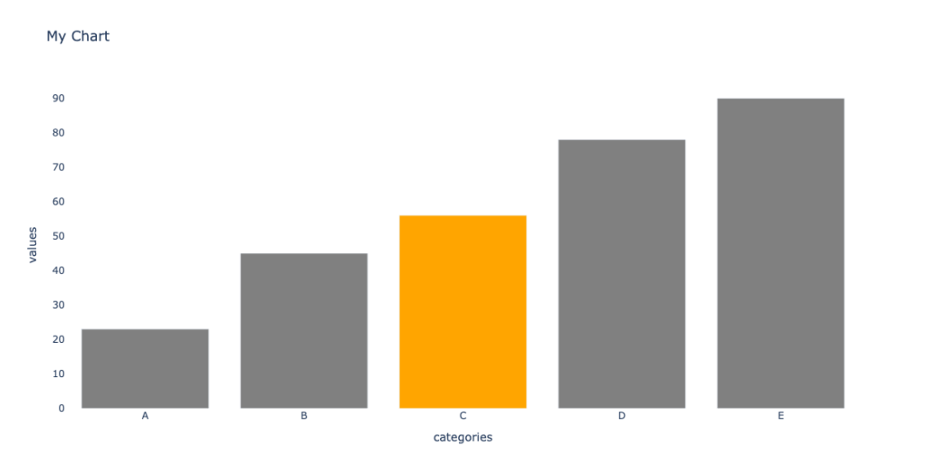
The implementation is flexible, so if you feel like changing one of the settings(i.e., show the grid lines or center the title) you can pass it via keyword arguments when calling the function.


from typing import Any
import pandas as pd
import plotly.graph_objects as go
import pandas as pd
def barchart(
df: pd.DataFrame, x_col: str, y_col: str,
title: str | None = None,
latent_color : str = 'gray',
prominent_color: str = 'orange',
prominent_value: Any | None = None,
**kwargs: dict,
) -> go.Figure:
"""_summary_
Args:
df (pd.DataFrame): Dataframe to plot
x_col (str): Name of x coloumn
y_col (str): Name of y coloumn
title (str | None, optional): Chart title. Defaults to None.
latent_color (str, optional): Color to use for the values we don't want to highlight. Defaults to 'gray'.
prominent_color (str, optional): Color to use for the value we want to highlight. Defaults to 'orange'.
prominent_value (Any | None, optional): Value of the category we want to highlight. Defaults to None.
Returns:
go.Figure: Plotly figure object
"""
colors = (df[x_col] == prominent_value).replace(False, latent_color).replace(True, prominent_color).to_list()
fig = go.Figure(data=[
go.Bar(
x=df[x_col],
y=df[y_col],
marker_color=colors
)],
layout=go.Layout(
title=title,
xaxis=dict(title=x_col, showgrid=False),
yaxis=dict(title=y_col, showgrid=False),
plot_bgcolor='white',
paper_bgcolor='white'
)
)
fig.update_layout(**kwargs)
return fig
if __name__ == "__main__":
data = {'categories': ['A', 'B', 'C', 'D', 'E'],
'values': [23, 45, 56, 78, 90]}
df = pd.DataFrame(data)
fig = barchart(df, 'categories', 'values', prominent_value='C', title='My Chart', yaxis_showgrid=True)
fig.show()

5 interesting things (06/07/2023)

Potential impacts of Large Language Models on Engineering Management – this post is an essential starter for a discussion, and I can think of other impacts. For example – how interviewing \ assessing skills of new team members affected by LLMs? What skills should be evaluated those days (focusing on engineering positions)?

One general caveat for using LLMs is completely trusting them without any doubts. This is crucial for a performance review.  Compared to code, if the code does not work, it is easy to trace and fix. If the performance review needs to be corrected, it might be hard to pinpoint what and where it got wrong, and the person getting it might need more confidence to say something.

https://www.engstuff.dev/p/potential-impacts-of-large-language

FastAPI best practices – one of the most reasoned and detailed guides I read. Also, the issues serve as comments to this guide and are worth reading. Ideally, I would like to take most of the ideas and turn them into a cookie-cutter project that is easy to create. 

https://github.com/zhanymkanov/fastapi-best-practices

How Product Strategy Fails in the Real World — What to Avoid When Building Highly-Technical Products – I saw all in action and hope to do better in the future.

https://review.firstround.com/how-product-strategy-fails-in-the-real-world-what-to-avoid-when-building-highly-technical-products

1 dataset 100 visualizations – I imagine this project as an assignment in a data visualization/data journalism course.  Yes, there are many ways to display data. Are they all good? Do they convey the desired message?

There is a risk in being too creative, and there is some visualization there I cannot imagine using for anything reasonable.

https://100.datavizproject.com/

Automating Python code quality – one additional advantage of using tools like Black, isort, etc., is that it reduces the cognitive load when doing a code review. The code reviewer should no longer check for style issues and can focus on deeper issues.

https://blog.fidelramos.net/software/python-code-quality

Bonus – more extensive pre-commit template – 

https://github.com/br3ndonland/template-python/blob/main/.pre-commit-config.yaml

Exploratory Data Analysis Course – Draft

Last week I gave an extended version of my talk about box plots in Noa Cohen‘s Introduction to Data Science class at Azrieli College of Engineering Jerusalem. Slides can be found here.

The students are 3rd and 4th-year students, and some will become data scientists and analysts. Their questions and comments and my experience with junior data analysts made me understand that a big gap they have in purchasing those positions and performing well is doing EDA – exploratory data analysis. This reminded me of the missing semester of your CS education – skills that are needed and sometimes perceived as common knowledge in the industry but are not taught or talked about in academia. 

“Exploratory Data Analysis (EDA) is the crucial process of using summary statistics and graphical representations to perform preliminary investigations on data in order to uncover patterns, detect anomalies, test hypotheses, and verify assumptions.” (see more here). EDA plays an important role in everyday life of anyone working with data – data scientists, analysts, and data engineers. It is often also relevant for managers and developers to solve the issues they face better and more efficiently and to communicate their work and findings.

I started rolling in my head how would a EDA course would look like –

Module 1 – Back to basics (3 weeks)

  1. Data types of variables, types of data
  2. Basic statistics and probability, correlation
  3. Anscombe’s quartet
  4. Hands on lab – Python basics (pandas, numpy, etc.)

Module 2 – Data visualization (3 weeks)

  1. Basic data visualizations and when to use them – pie chart, bar charts, etc.
  2. Theory of graphical representation (e.g Grammar of graphics or something more up-to-date about human perception)
  3. Beautiful lies – graphical caveats (e.g. box plot)
  4. Hands-on lab – python data visualization packages (matplotlib, plotly, etc.).

Module 3 – Working with non-tabular data (4 weeks)

  1. Data exploration on textual data
  2. Time series – anomaly detection
  3. Data exploration on images

Module 4 – Missing data (2 weeks)

  1. Missing data patterns
  2. Imputations
  • Hands-on lab – a combination of missing data \ non-tabular data

Extras if time allows-

  1. Working with unbalanced data
  2. Algorithmic fairness and biases
  3. Data exploration on graph data

I’m very open to exploring and discussing this topic more. Feel free to reach out – twitterLinkedIn