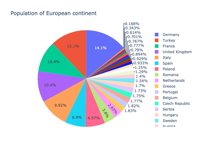
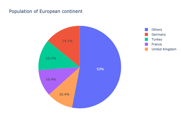
This morning I read “20 ideas for better data visualization“. I liked it very much and specially I found 8th idea – “Limit the number of slices displayed in a pie chart” very relevant for me. So I jumped into the plotly express code and created a figure of type other_pie which given a number (n) and a label (other_label) created a pie chart with n sectors. n-1 of those sectors are the top values according to the `values` column and the other section is the sum of the other rows.
A gist of the code can be found here (check here how to build plotly)
I used the following code to generate standard pie chart and pie chart with 5 sectors –
import plotly.express as px
df = px.data.gapminder().query("year == 2007").query("continent == 'Europe'")
df.loc[df['pop'] < 2.e6, 'country'] = 'Other countries' # Represent only large countries
pie_fig = px.pie(df, values='pop', names='country', title='Population of European continent')
otherpie_fig = px.other_pie(df, values='pop', names='country', title='Population of European continent', n=5, other_label="others")
And this is how it looks like –

