Thoughts on Tech Debt

I have been thinking about tech debt for a while now and how to address it daily. Few dilemmas for example – 

  • Should we update our Python version or a version of one of the packages we use?
  • We thought of a more efficient implementation for one of our functions. Should we invest time in it? When?
  • What task should we prioritize for the next sprint? 

How do we measure our technical debt? Are we getting better, and what does better means? Or at least not worse?

So I have compiled a small reading list that I can share with my team and align on terminology and ideas. Feel free to add your thoughts.

The 4 main types of technical debt – this is an explanation of Martin Fowler’s Technical Debt Quadrant. This is a first step towards establishing a common language about technical debt.

https://blog.codacy.com/4-types-technical-debt/

The different types of technical debt – Another piece in the puzzle to use a common terminology. While the split into categories makes sense, I don’t entirely agree with the fixes and impacts.

https://techdebtguide.com/types-of-technical-debt

The 25 Percent Rule for Tackling Technical Debt – a post from Shopify engineering blog about their pillars of tech debt and a recommendation on how to invest time on those topics. That made me think about whether the discussion about tech debt should differ between different stages or sizes of companies

https://shopify.engineering/technical-debt-25-percent-rule

A Framework for Prioritizing Tech Debt – this post tries to get the analogy closer to real debt and examine the interest rate. If I took this analogy one step further, I would say that it is a loan, and the prioritization and the remediations are the terms that we choose on loan, and sometimes those terms change either because we recycle the loan, win a big sum and can pay back, etc. Or because something external changed, e.g., interest rate.

https://www.maxcountryman.com/articles/a-framework-for-prioritizing-tech-debt

Tech Debt Isn’t a Burden, It’s a Strategic Lever for Success – the approach here is closer to the loan analogy – “view tech debt as a strategic lever for your organization’s success over time”. That, together with other points in this post, made me think about the relations and interactions of product debt and tech debt – are they correlated or independent, and what influences them? are there any patterns in this duo or maybe trio (with business debt). I didn’t yet find something to read about the topic that I was happy with.

https://www.reforge.com/blog/managing-tech-debt

7 Top Metrics for Measuring Your Technical Debt – this post suggests several metrics to measure technical debt, such as code churn, cycle time, code quality, and tools for measuring technical debt. One issue is that it does not cover infrastructure debt or process debt. For example – the complexity of deploy process, duplication between repositories, etc. Additionally, the underlying assumption in this post is that “tech debt is bad,” while I view it as a strategy or a trade-off. I also don’t believe that one size fits all – if you want to measure, choose the one thing that is most important and informative for you, and don’t worry if it changes over time.

https://dev.to/alexomeyer/8-top-metrics-for-measuring-your-technical-debt-5bnm

Exploratory Data Analysis Course – Draft

Last week I gave an extended version of my talk about box plots in Noa Cohen‘s Introduction to Data Science class at Azrieli College of Engineering Jerusalem. Slides can be found here.

The students are 3rd and 4th-year students, and some will become data scientists and analysts. Their questions and comments and my experience with junior data analysts made me understand that a big gap they have in purchasing those positions and performing well is doing EDA – exploratory data analysis. This reminded me of the missing semester of your CS education – skills that are needed and sometimes perceived as common knowledge in the industry but are not taught or talked about in academia. 

“Exploratory Data Analysis (EDA) is the crucial process of using summary statistics and graphical representations to perform preliminary investigations on data in order to uncover patterns, detect anomalies, test hypotheses, and verify assumptions.” (see more here). EDA plays an important role in everyday life of anyone working with data – data scientists, analysts, and data engineers. It is often also relevant for managers and developers to solve the issues they face better and more efficiently and to communicate their work and findings.

I started rolling in my head how would a EDA course would look like –

Module 1 – Back to basics (3 weeks)

  1. Data types of variables, types of data
  2. Basic statistics and probability, correlation
  3. Anscombe’s quartet
  4. Hands on lab – Python basics (pandas, numpy, etc.)

Module 2 – Data visualization (3 weeks)

  1. Basic data visualizations and when to use them – pie chart, bar charts, etc.
  2. Theory of graphical representation (e.g Grammar of graphics or something more up-to-date about human perception)
  3. Beautiful lies – graphical caveats (e.g. box plot)
  4. Hands-on lab – python data visualization packages (matplotlib, plotly, etc.).

Module 3 – Working with non-tabular data (4 weeks)

  1. Data exploration on textual data
  2. Time series – anomaly detection
  3. Data exploration on images

Module 4 – Missing data (2 weeks)

  1. Missing data patterns
  2. Imputations
  • Hands-on lab – a combination of missing data \ non-tabular data

Extras if time allows-

  1. Working with unbalanced data
  2. Algorithmic fairness and biases
  3. Data exploration on graph data

I’m very open to exploring and discussing this topic more. Feel free to reach out – twitterLinkedIn

5 interesting things (03/11/2022)

How to communicate effectively as a developer. – writing effectively is the second most important skill after reading effectively and one of the skills that can differentiate you and push you forward. If you read only one thing today, read this – 

https://www.karlsutt.com/articles/communicating-effectively-as-a-developer/

26 AWS Security Best Practices to Adopt in Production – this is a periodic reminder to pay attention to our SecOps. This post is very well written and the initial table of AWS security best practices by service is great. 

https://sysdig.com/blog/26-aws-security-best-practices/

EVA Video Analytics System – “EVA is a new database system tailored for video analytics — think MySQL for videos.”. Looks cool on first glance and I can think off use cases for myself, yet I wonder if it could become a production-level grade.

https://github.com/georgia-tech-db/eva

I see it as somehow complementary to – https://github.com/impira/docquery

Forestplot – “This package makes publication-ready forest plots easy to make out-of-the-box.”. I like it when academia and technology meet and this is really usable, also for data scientists’ day-to-day work. The next step would probably be deep integration with scikit-learn to pandas.

https://github.com/lsys/forestplot

Bonus – Python DataViz cookbook – easy way to navigate between the different common python visualization practices (i.e via pandas vs using matplotlib / plotly /  seaborn). I would like to see it going to the next step – controlling the colors, grid, etc. from the UI and then switching between the frameworks but that’s a starting point.

https://dataviz.dylancastillo.co/

roadmap.sh – it is not always clear how to level up your skills, what you should learn next (best practices, technology – which, etc). Roadmap.sh attempts to create such roadmaps. While I don’t agree with everything there, I think that the format and references are nice and it is a good inspiration.

https://roadmap.sh/

Shameless plug – Growing A Python Developer (2021), I plan to write a small update in the near future.

Think outside of the Box Plot

Earlier today, I spoke at DataTLV conference about box plots – what they expose, what they hide, and how they mislead. My slides can be found here, and the code used to generate the plots is here

Key takeaways

  • Boxplots show 5 number statistics – min, max, median, q1 and,q3.
  • The flaws of Box Plots can be divided into two – data that is not present in the visualization (e.g. number of samples, distribution) and the visualization being counter-intuitive (e.g. quartiles is hard to grasp the concept).
  • I choose solutions that are easy to implement, either by leveraging existing packages code or by adding small tweaks. I used plotly.
  • Aside of those adjustment I many times box plot is just not the right graph for the job.
  • If the statistical literacy of your audience is not well founded I would try avoiding using box plot.

Topics I didn’t talk about and worth mentioning

  • Mary Eleanor Hunt Spear –  data visualization specialize who pioneered the development of the bar chart and box plot. I had a slide about her but went too fast, and skipped it. See here.
  • How percentiles are calculated – Several methods exist, and different Python packages use different default methods. Read more –http://jse.amstat.org/v14n3/langford.html

Resources I used to prepare the talk

5 interesting things (29/08/2022)

Human genetics 101 – a new blog about genetics by Nadav Brandes, who works at UCSF as part of the Ye lab. Reading is very accessible even to non-biologist (like me :).

https://incrementally.net/2022/07/16/human-genetics-101/

It’s probably time to stop recommending Clean Code – that’s a relatively old post (from 2020) discussing a book that was published in 2008. It is a very common recommendation in the industry, and therefore, I think this post is so important. It is detailed and gives good examples, and reminds us that everything has to be taken with a grain of salt. I agree with the concluding paragraphs – experienced developers will gain almost nothing from reading the book, and inexperienced developers would have a hard time separating the wheat from the chaff.

https://qntm.org/clean

Bonus – https://gordonc.bearblog.dev/dry-most-over-rated-programming-principle/

The many flavors of hashing – I like to be back to basic from time to time.

https://notes.volution.ro/v1/2022/07/notes/1290a79c/

Five Lessons Learned From Non-Profit Management That Apply to Tech Management – I like those mixes when practices and ideas from one domain of someone’s life emerge in another domain. Those intersections are usually very productive and insightful.

https://medium.com/management-matters/5-lessons-learned-from-non-profit-management-that-apply-to-tech-management-add47980498a

Demystifying the Parquet File Format – I finally feel I understand how the parquet format works (although there are many more optimizations).

https://towardsdatascience.com/demystifying-the-parquet-file-format-13adb0206705

5 interesting things (22/07/2022)


I analyzed 1835 hospital price lists so you didn’t have to
 – this post had a few interesting things. First, learning about CMS’s price transparency law. In Israel this is a non-issue since the healthcare system works differently, and most of the procedures are covered by the HMOs so there is no such concern. I would be interested in further analysis about the missing or non-missing prices. I.e., for which CPT codes most hospitals have prices, for which CPT codes most hospitals don’t have prices, can we cluster them (e.g. cardio codes? women’s health? procedures usually done on elder people?). This dataset has great potential, and I agree with most of the points in the “Dead On Arrival: What the CMS law got wrong” section.

https://www.dolthub.com/blog/2022-07-01-hospitals-compliance/

How to design better APIs – there are several things I liked in this post – first, it is written very clearly and gives both positive and negative examples. Second, it is language agnostic. That last tip – “Allow expanding resources” was mind-blowing to me, so simple to think of and I never thought of adding such an argument. Now I miss a cookie-cutter template to implement all that good advice.

https://r.bluethl.net/how-to-design-better-apis

min(DALL-E) – “This is a fast, minimal port of Boris Dayma’s DALL·E Mega. It has been stripped down for inference and converted to PyTorch. The only third-party dependencies are NumPy, requests, pillow, and torch”. Now you can easily generate images using min-dalle on your machine (but it might take a while),

https://github.com/kuprel/min-dalle

Bonus – https://openai.com/blog/dall-e-2-pre-training-mitigations/

4 Things I Learned From Analyzing Menopause Apps Reviews – Dalya Gartzman, She Knows Health CEO, writes about 4 lessons she learned from analyzing Menopause Apps Reviews. I think it is interesting in 2 ways – app reviews are first, as a product-market fit strategy, to see what users are telling, asking, or complaining about in related.

https://medium.com/sheknows-health/4-things-i-learned-from-analyzing-menopause-apps-reviews-2cabf9ca9226

Inconsistent thoughts on database consistency – this post discusses the many aspects and definitions of consistency and how it is used in different contexts. I absolutely love those topics. Having said that, I wonder if people hold those discussions in real life and not just use common cloud-managed solutions encapsulating some of those concerns.

https://www.alexdebrie.com/posts/database-consistency/

Playing with DALL·E mini

DALL·E 2 is a multimodal AI system that generates images from text. OpenAI announced the model in April 2022. OpenAI is known for GPT-3, an autoregressive language model with 175 billion parameters. DALL·E 2 uses a smaller version of GPT-3. Read more herehere, and here (the last one also slightly discusses Google’s image).

While the results look impressive at first sight, there are some caveats and limitations, including word order and compositionality issues, e.g., “A yellow book and a red vase” from “A red book and a yellow vase” are indistinguishable. Moreover, as one can see in the “A yellow book and a red vase” example below the images or more of the same, another drawback is that the system cannot handle negation, e.g., “A room without an elephant” will create, well, see below. Read more here.

Since I don’t have access to DALL·E 2, I used DALL·E mini via Hugging Face for all the examples in this post. However, the two models experience the same issues.

A yellow book and a red vase
A room without an elephant

The model might have biases for example check all those software developers who write code, all men (also note that the face are very blurry in contrast to other surfaces in the images) –

software developer writing code
A CTO giving a talk

I decided to troll that a bit to find more limitations or point-out blind spots. Check out the following examples –

Object Oriented Programming
OOP
Object Disoriented Programming
Exploratory Data Analysis
EDA

The examples above demonstrate that model does not handle abbreviations well. I can think of several reasons for that, but that emphasizes the need to use precise wording and might need to try several times to get the desired result.

Trying negation again (in this case, the abbreviation worked okish) –

SQL
NoSQL
Structured Query Language

Which of course reminds all of us of this one –

And a few more –

SOLID principles
Clean Code
Computer Vision

To conclude, I cannot see a straightforward production-grade usage of this model (and it is anyhow not publically available yet) but maybe one use it for brainstorming and ideation. For me it feels like NLP in the days of TF-IDF there is yet a lot to come. Going forward I would love to have some more tunning possibilities like a color scheme or control the similarity between different results (mainly allow more diversity rather than more of the same).

5 interesting things (20/06/2022)

Visualizing multicollinearity in Python – I like the network one although it is not very intuitive at first sight. The others you can also get using pandas-profiling.

https://medium.com/@kenanekici/visualizing-multicollinearity-in-python-b5feedc9b3f1

Advanced Visualisations for Text Data Analysis – besides the suggested charts themselves, it is nice to get to know nxviz. I would actually like to see those charts as part of plotly as well.

https://towardsdatascience.com/advanced-visualisations-for-text-data-analysis-fc8add8796e2
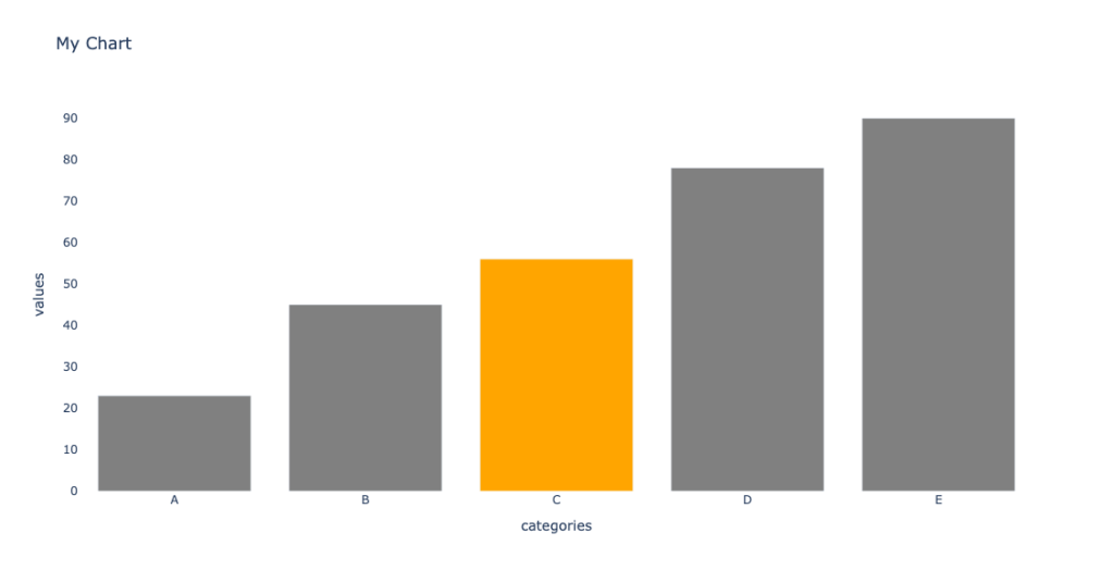
Data Tales: Unlikely Plots – bar chart is boring (but informative :), but sometimes we need to think out of the box plot

https://medium.com/mlearning-ai/data-tales-unlikely-plots-1882c2a903da

XKCDs I send a lot – Is XKCD already an industry standard?

https://medium.com/codex/xkcds-i-send-at-least-once-a-month-1f6e9f9b6b89

5 Tier Problem Hierarchy – I use this framework to think of tickets I write, what is the expected input, output, and complexity, what I expect from each of my team members, etc.

https://typeshare.co/kimsiasim/posts/5-tier-problem-hierarchy-4718

Prioritize your Priority Score

A while ago, a friend asked me about a topic she needed to tackle – her team had many support tickets to prioritize, decide what to work on, and further communicate it to the relevant stakeholders.

They started as everyone starts – tier 1 and tier 2 support teams in their company stated the issue severity (low, medium, high) in the ticket, and they prioritized accordingly.

But that was not good enough. It was not always clear how to set the severity level – was it the client size or lifecycle stage, the feature importance, or anything else. Additionally, it was not granular enough to decide what to work on first.

We brainstormed, and she told me two important things for her: feature importance and client size. Both can be reduced to “t-shirt” size estimation, i.e., small client, medium client, large client, and extra-large client, and features of low/medium/high/crucial importance. Super, we can now generalize the single dimension axis system we previously had to two dimensions.

The priority score is now – \sqrt{x^2+y^2}

That worked great until they had a few tickets that got the same priority score, and they needed to decide what to work on and explain it outside of their team. The main difference between those tickets was the time it would take to fix each one. One would take several hours, one would take 1-2 days, and the last one would take two weeks and has high uncertainty. No problem, I told her – let’s add another axis – the expected time to fix. Time to fix can also be binned – up to 1 day, up to 1 week, up to 1 sprint (2 weeks), and longer. Be cautious here; the ax order is inverted – the longer it takes, the lower priority we want to give it.

The priority score is now – \sqrt[\leftroot{-2}\uproot{2}3]{x_1^3+x_2^3+x_3^3}

Then, when I felt we were finally there, she came and said – remember the time to fix dimension? Well, it is not as important as the client size and the feature importance. Is there anything we can do about it?

Sure I said, let’s add weights. The higher the weight is, the more influential the feature is. To keep things simple in our example, let’s reduce the importance of the time to fix compared to the other dimensions – \sqrt[\leftroot{-2}\uproot{2}3]{x_1^3+x_2^3+0.5 x_3^3}


To wrap things up

  1. This score can be generalized to include as many dimensions as one would like – \sqrt[\leftroot{-2}\uproot{2}n]{\sum_{i=1}^n w_i x_i^n}.
  2. I recommend keeping the score as simple and minimal as possible since it is easier to explain and communicate.
  3. Math is fun and we can use relatively simple concepts to obtain meaningful results.

CSV to radar plot

I find a radar plot a helpful tool for visual comparison between items when there are multiple axes. It helps me sort out my thoughts. Therefore I created a small script that helps me turn CSV to a radar plot. See the gist below, and read more about the usage of radar plots here.

So how does it works? you provide a csv file where the columns are the different properties and each record (i.e line) is a different item you want to create a scatter for.

The following figure was obtained based on this csv –

https://gist.github.com/tomron/e5069b63411319cdf5955f530209524a#file-examples-csv

The data in the file is based on – https://www.kaggle.com/datasets/shivamb/company-acquisitions-7-top-companies

And I used the following command –

python csv_to_radar.py examples.csv --fill toself --show_legend --title "Merger and Acquisitions by Tech Companies" --output_file merger.jpeg
Radar plot
import plotly.graph_objects as go
import plotly.offline as pyo
import pandas as pd
import argparse
import sys
def parse_arguments(args):
parser = argparse.ArgumentParser(description='Parse CSV to radar plot')
parser.add_argument('input_file', type=argparse.FileType('r'),
help='Data File')
parser.add_argument(
'–fill', default=None, choices=['toself', 'tonext', None])
parser.add_argument('–title', default=None)
parser.add_argument('–output_file', default=None)
parser.add_argument('–show_legend', action='store_true')
parser.add_argument('–show_radialaxis', action='store_true')
return parser.parse_args(args)
def main(args):
opt = parse_arguments(args)
df = pd.read_csv(opt.input_file, index_col=0)
categories = [*df.columns[1:], df.columns[1]]
data = [go.Scatterpolar(
r=[*row.values, row.values[0]],
theta=categories,
fill=opt.fill,
name=label) for label, row in df.iterrows()]
fig = go.Figure(
data=data,
layout=go.Layout(
title=go.layout.Title(text=opt.title, xanchor='center', x=0.5),
polar={'radialaxis': {'visible': opt.show_radialaxis}},
showlegend=opt.show_legend
)
)
if opt.output_file:
fig.write_image(opt.output_file)
else:
pyo.plot(fig)
if __name__ == "__main__":
main(sys.argv[1:])
view raw csv_to_radar.py hosted with ❤ by GitHub
Parent Company 2017 2018 2019 2020 2021
Facebook 3.0 5.0 7.0 7.0 4.0
Twitter 0.0 1.0 3.0 3.0 4.0
Amazon 12.0 4.0 9.0 2.0 5.0
Google 11.0 10.0 8.0 8.0 4.0
Microsoft 9.0 17.0 9.0 8.0 11.0
view raw examples.csv hosted with ❤ by GitHub
numpy==1.22.4
pandas==1.4.2
plotly==5.8.0
python-dateutil==2.8.2
pytz==2022.1
six==1.16.0
tenacity==8.0.1