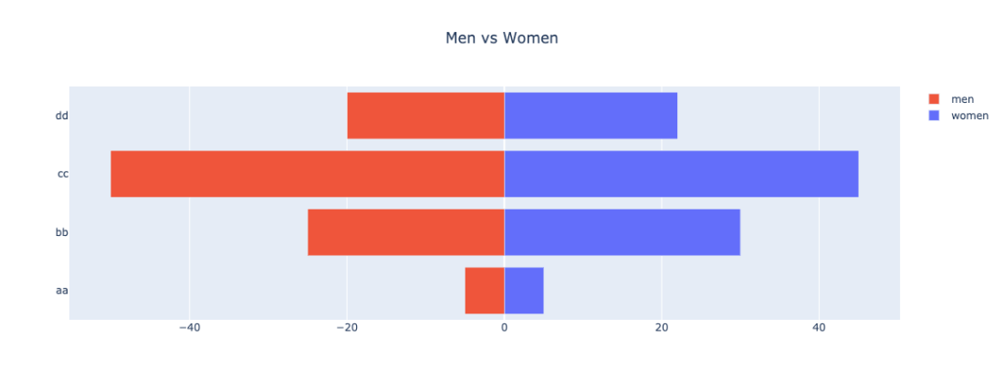
I’m reading “storytelling with data” by Cole Nussbaumer Knaflic. I plan to write my thoughts and insights from the book once I finish it. For now, I wanted to play with it a bit and create a better bar chart visualization that –
- Highlight the category you find most important and assign a special color to it (i.e
prominent_colorin the code), while the remaining categories used the same color (i.e.latent_color) - Remove grids and make the background and paper colors the same to remove cognitive load.

The implementation is flexible, so if you feel like changing one of the settings(i.e., show the grid lines or center the title) you can pass it via keyword arguments when calling the function.
This file contains hidden or bidirectional Unicode text that may be interpreted or compiled differently than what appears below. To review, open the file in an editor that reveals hidden Unicode characters.
Learn more about bidirectional Unicode characters
| from typing import Any | |
| import pandas as pd | |
| import plotly.graph_objects as go | |
| import pandas as pd | |
| def barchart( | |
| df: pd.DataFrame, x_col: str, y_col: str, | |
| title: str | None = None, | |
| latent_color : str = 'gray', | |
| prominent_color: str = 'orange', | |
| prominent_value: Any | None = None, | |
| **kwargs: dict, | |
| ) -> go.Figure: | |
| """_summary_ | |
| Args: | |
| df (pd.DataFrame): Dataframe to plot | |
| x_col (str): Name of x coloumn | |
| y_col (str): Name of y coloumn | |
| title (str | None, optional): Chart title. Defaults to None. | |
| latent_color (str, optional): Color to use for the values we don't want to highlight. Defaults to 'gray'. | |
| prominent_color (str, optional): Color to use for the value we want to highlight. Defaults to 'orange'. | |
| prominent_value (Any | None, optional): Value of the category we want to highlight. Defaults to None. | |
| Returns: | |
| go.Figure: Plotly figure object | |
| """ | |
| colors = (df[x_col] == prominent_value).replace(False, latent_color).replace(True, prominent_color).to_list() | |
| fig = go.Figure(data=[ | |
| go.Bar( | |
| x=df[x_col], | |
| y=df[y_col], | |
| marker_color=colors | |
| )], | |
| layout=go.Layout( | |
| title=title, | |
| xaxis=dict(title=x_col, showgrid=False), | |
| yaxis=dict(title=y_col, showgrid=False), | |
| plot_bgcolor='white', | |
| paper_bgcolor='white' | |
| ) | |
| ) | |
| fig.update_layout(**kwargs) | |
| return fig | |
| if __name__ == "__main__": | |
| data = {'categories': ['A', 'B', 'C', 'D', 'E'], | |
| 'values': [23, 45, 56, 78, 90]} | |
| df = pd.DataFrame(data) | |
| fig = barchart(df, 'categories', 'values', prominent_value='C', title='My Chart', yaxis_showgrid=True) | |
| fig.show() |